After Bing and Yahoo!, its Google who has decided to redesign its logo, but the latter has changed it ever so slightly that you may not even realize that something is amiss. The search engine giant has simply made the logo a little flat and the colors come across as way lighter than the earlier version.
And that’s not quite all. Taking a leaf out of the Yahoo! book, who recently revamped its homepage, Google too has introduced some changes to its start page. Up until now, a black-colored navigation bar with a list of the company’s services appeared on the top part of the screen. But the new design doesn’t feature the bar anymore. Instead, all the services have now been shifted on the right hand side and they stay hidden unless you want to use one of them.
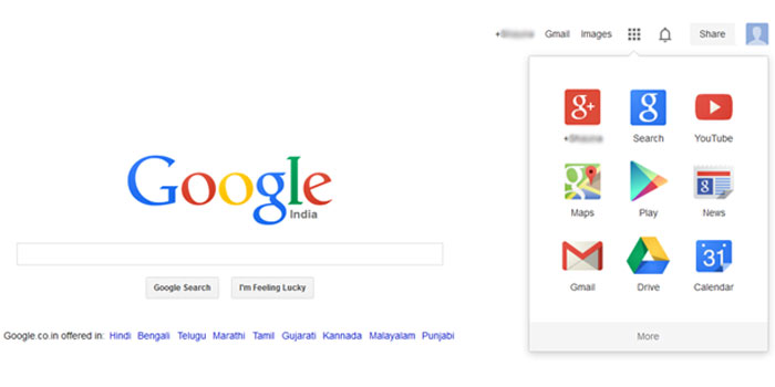
An app launcher has been placed on the screen and on clicking the icon, a menu window will open which houses all of the services. As you can see in the picture above, the launcher features G Plus, Search, YouTube, Maps, Google Play, News, Gmail, Drive and Calendar on top. On clicking the ‘More’ button, other applications like Translate, Blogger, Offers, Wallet, Books, Finance, Photos and Shopping will appear. Some more services show up if you hit the even more tab below these.
The new logo and homepage have been rolled out, but not everyone can see it yet. Give it a few weeks and the new and improved homepage will materialize on all browsers around the globe. So do you like the new look? Do tell us.